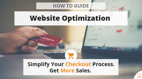
Website Optimization: Simpler Is Better
Website optimization is largely a matter of creating a website that meets the user’s needs in the simplest way possible.
Here’s a known truth of human behavior: when people have more options, they make fewer decisions.
Analysis paralysis and decision fatigue are real. A key aspect of website optimization is simplifying your checkout process.
Over three quarters of customers leave full shopping carts without making a purchase. That’s a devastatingly high cart abandonment rate.
Why do so many people leave their ecommerce carts?
Here’s another truth about humans: people want things to be easy.
People leave their shopping carts because there are too many decisions to make and the buying process is too hard.
It seems crazy, but people will drop out of making a purchase as soon as they have to make one too many choices or fill in one to many forms. People are fickle monsters.
A simple checkout process keeps more people in the buying pipeline until the sale is finished.
So how do you simplify your checkout process? How do you reduce the choices people need to make without being too restrictive?
Some of the answers will sound counterintuitive. But they work.
Here’s how to make your checkout process better by making it more minimal:
Only Give Shoppers As Many Options As They Need
This advice is primarily centered around the parts of the buying process where the customer really needs options:
- Payment options.
- Shipping options.
- Product variations.
The paradox here is that you need to offer some flexibility in these areas in order to meet the needs of the greatest number of customers. We’ll address the one that’s furthest from the purchase first.
Product Variations
When it comes to product variations there are two ways to avoid offering too many options:
- Limit the number of variations per page that a customer can view. Some products necessitate options. To avoid deterring a buying decision with too many options, limit your products per page to around four. This way customers can find what they want without getting overwhelmed an fleeing back to the safety of cat videos.
- Reduce the number of variations you offer. This is especially true with products where the difference between models is minimal, like t-shirts. It might be tempting to offer every color imaginable. But then customers end up struggling with which color gray they like best, rather than just buying a shirt. Reduce the variations you offer by eliminating variants that are mostly the same.
Shipping options
If you wanted, you could offer ten or even twenty shipping options. FedEx, UPS, USPS, courier. The list goes on. But the best way to choose the shipping options you offer is to remember that shipping options boil down to two things:
- Speed.
- Cost.
Shipping is either fast or cheap. All customers want both. But they prefer one or the other, because they know they can’t have both.
So offer a fast option, a cheap option, and a middle of the road option. To help take the decision off the customer’s plate, autoselect the middle of the road option. Most people won’t bother to change it. They also won’t opt out of the buying process because they have to choose.
Payment options
This is the most nerve wracking aspect of website optimization.
The main worry is that reducing the number of payment options limits the number of people who can purchase from your store.
This is true.
However, you’ll lose more sales to cart abandonment than to a lack of payment options. The vast majority of people pay with just a couple payment options. Typically, if you accept credit cards and PayPal, you’ll have just about everybody covered.
Offering another option like Google Wallet or Apple Pay can help. But it’s 2018; the number of people who buy things using checks and money orders is so low that there’s very little return—if any—to offering these payment options.
Since most of the information collection for PayPal, Google Wallet, Apple Pay, and others takes place on those websites, credit cards represent most of the drama related to payment options.
The most efficient payment screen layout is to present the credit card form, with links to the third party payment options below or next to the credit card form.
The issue then becomes a matter of simplifying. The goal is to reduce the amount of information the customer must manually enter. There are a few fields that your site can autofill for the customer based on other information they submit:
- Credit card type. Each type of credit card has a prefix that identifies the card type. Your website should autodetect the card type and select it for the customer once they enter the credit card number. It’s just one less step the customer needs to take to finish a purchase.
From a coding standpoint, this is fairly simple to implement. Some companies offer APIs to accomplish this.
- Name. If the customer has filled out a form or signed up for your email list during their visit, your website can autofill this information in the personal information form.
- Email address. This is especially easy if your sales funnel uses a lead magnet or a tripwire. It can even be achieved if they return days or even weeks later to make a purchase after entering their information into the lead magnet or tripwire form.
It also works for people who click through to your store from one of your marketing emails.
Again, this simply reduces how much work the customer has to do to complete the buying cycle.
Both of these are a bit more complex from a development standpoint, so you should work with your web developer or provider to get your form completion dialed.
Then, there are two things that you can simply remove from your website to make life easier for your customers.
First, combine your checkout process into the fewest possible pages. Ideally, the customer should be able to finish their purchase in two pages. However, the difference in overall conversion rates between two page checkout flows and three page checkout flows is pretty small. It could be a statistical anomaly.
But a four page checkout flow is a bad idea. At four pages, people start to drop off.
Second, never require your customer to create an account in order to purchase. Thinking about creating passwords and usernames and then having to remember them causes anxiety.
You should absolutely avoid causing anxiety during the checkout process. Requiring first-time customers to create an account to make a purchase chases a lot of people away.
I’m one of those people who refuses to make that first purchase if the site requires me to create an account. This is serious.
If you’d like to offer customers an opportunity to create an account for future purchases, include a link to your account creation page in the order confirmation email.
These are fairly simple changes that actually make things much simpler for the customer and will reduce your cart abandonment rates.
However, there are also ways that you can improve your website to make your own life easier.
Built in Data Validation
Incorrect information causes issues in the order fulfillment process. It’s a headache for both you and the customer.
While it’s nearly impossible to prevent customers from using addresses besides their primary residence—and you wouldn’t want to anyway—you want to avoid getting typos or blatantly false information in your checkout process.
If the customer enters an invalid address, email address, or phone number, your website should prompt them to correct the error. This minimizes the chances of orders being shipped to the wrong address and ensures that you have good information for contacting the customer during the fulfillment process if you need to.
Building data validation into your checkout flow is actually really simple. You can validate any data that’s entered during checkout with a prebuilt API.
An API can easily check to make sure that the customer enters a real address, email address, and phone number. The entire process is transparent to the customer.
If they enter good information, they’ll proceed as usual. Otherwise, your site will simply indicate which information needs to be corrected before they can proceed to the next step.
If customers can opt in to your email list during the checkout process, this also protects the integrity of your email list and improves email deliverability.
So, have a look at your checkout process and evaluate how easy it is for your customers to finish their purchases. It’ll get you more sales.
Then, make your own life easier with checkout data validation. It’ll improve your customer service.


